
Cross-Modal Colour; When Senses Collide
I’ve been intending to write a piece like this since attending the Colour Society of Australia’s national conference in Sydney last year. Given the article about my synaesthesia that appeared in several newspapers last week I figured the time was right!
For me, colour has always been a rich experience, as has reading, as I see colours in letters and numbers. This is because of my synaesthesia, where sensory boundaries blur and one sense naturally evokes another. Yet even without synaesthesia, research shows that colour perception is inherently multisensory.
The Multisensory Nature of Colour
Colour doesn’t exist in isolation from the rest of our sensory world. It can seem to shift with the uniqueness of a sound, a bruh against fabric or the character of a scent. These patterns are called cross-modal correspondences and are systematic ways in which one sense influences our perception of another. So what we may think of as ‘seeing colour’ often involves listening, smelling, and feeling as well.
Experiments That Bridge the Senses
Recent studies highlight how closely our senses collaborate. Ryan et al. (2023) showed that certain odours can change how warm or intense a colour appears, suggesting that scent can literally influence our experience of hue.
Ogata and colleagues found, in 2023, that rounded, ‘Bouba-like’ chocolate shapes were perceived as sweeter than angular, ‘Kiki-like’ ones, even though the recipe was the same. It is believed that both the sound of the name and the shape of the sweet influences the chocolate taster’s perception.
Designers working with ‘sonic seasoning’ have also demonstrated that particular musical soundtracks can make the same food taste sweeter, more bitter, or more intense, depending on the pairing.
And I think we’ve all experienced retailers scenting their shops to enhance our experience and evoke memories.
Mechanisms of Integration
Psychologists and neuroscientists propose several reasons for these effects. Some point to environmental statistics, being natural pairings we learn over time, such as associating bright light with warmth. Others emphasise neural structure, noting that brain regions for different senses can overlap and influence each other. Some focus on semantic and affective similarity; shared meaning or shared emotional tone across senses. An example is how both soft textures and low-pitched sounds feel calming. Together, these mechanisms allow colour, sound, texture, and scent to form an integrated sensory map or story.
From Research to Wardrobe: my personal style practice
In my personal style work, this multisensory view of colour translates directly into the wardrobe. Magnified by my synaesthesia, certain palettes feel serene, joyful, sombre or even boring to me, and those impressions often align with how clients describe their emotional response to clothes. For instance, a client who feels overwhelmed by sharp, high-contrast outfits may gravitate toward rounded shapes, fluid fabrics, and softer colour transitions — the sartorial equivalent of Bouba rather than Kiki.
In my opinion, this supports treating clothing as a full sensory experience rather than a purely visual exercise; we are all so much more than a two dimensional image after all! When we look at a garment, we can ask ourselves not just “does this colour suit my complexion?” but “how does this feel in regards to sound, touch, and mood and does it align with my sartorial intention for the day?”.
For example, a crisp, angular blazer in a high-chroma hue might register as bright and sharply on point; energising for some, irritating for others. On the other hand, a softly structured jacket in a muted tone can feel more relaxed and soothing. Again, this will work well for some people but for others it may not feel strong enough to support them.
I’m very interested in how clients feel in their clothes and whether they notice this as we try various outfits. Certain colours can seem louder or quieter, textures can affect the perceived warmth of a palette, and their body may relax or tense up in response.
Practical Ways to Apply This
You can begin to apply these principles to your own wardrobe in a few simple, reflective steps:
Notice your emotional soundtrack
When you put on a colour, ask: if this outfit were music, what would it sound like — sharp and percussive, or soft and melodic? Choose pieces whose ‘sound’ aligns with the energy you want for your day or event.
Pair shape and colour with intention
Just as rounded chocolates can taste sweeter, rounded silhouettes and flowing lines often feel gentler and more approachable, especially in harmonious, analagous or blended palettes. Angular cuts, strong shoulders, and high contrast can communicate clarity and decisiveness. Use these combinations deliberately rather than by default. Check out my curated colour schemes for more on this.
Curate textures as part of your palette
Treat texture as another form of colour. Smooth, glossy fabrics can make a colour feel cooler and more precise; brushed, tactile weaves can make the same hue feel warmer and more relaxed. When you’re choosing between two pieces in similar colours, notice which feels right against your skin and in your nervous system.
Create ‘sensory-coherent’ outfits
Aim for outfits where colour, shape, texture, and even accessories tell the same sensory story. For example, a calming work look might combine a low-contrast palette, soft drape, and minimal jewellery, whereas a presentation outfit could lean into clearer lines, brighter accents, and a slightly ‘louder’ visual rhythm.
Let values guide sensory choices
Many of my clients are drawn to ethically made, well-designed pieces because they want their wardrobe to feel congruent with their inner life. When your clothes feel right across senses, they tend to align better, look cohesive and be worn more often, supporting a more sustainable, considered wardrobe.
When we understand colour as part of a broader sensory conversation, personal style becomes less about rules and more about tuning into how we experience the world. In that space, your wardrobe can function as a kind of everyday multisensory design project — one that honours not just how you look, but how you think, feel, and move through your life.
PS: None of this is new; the Kiki and Bouba study was derived from a similar study by Köhler in 1929 and Wassily Kandinsky, George Field and Johannes Ittens were all working with intramodal, cross-dimensional associations in the nineteenth and early twentieth centuries.
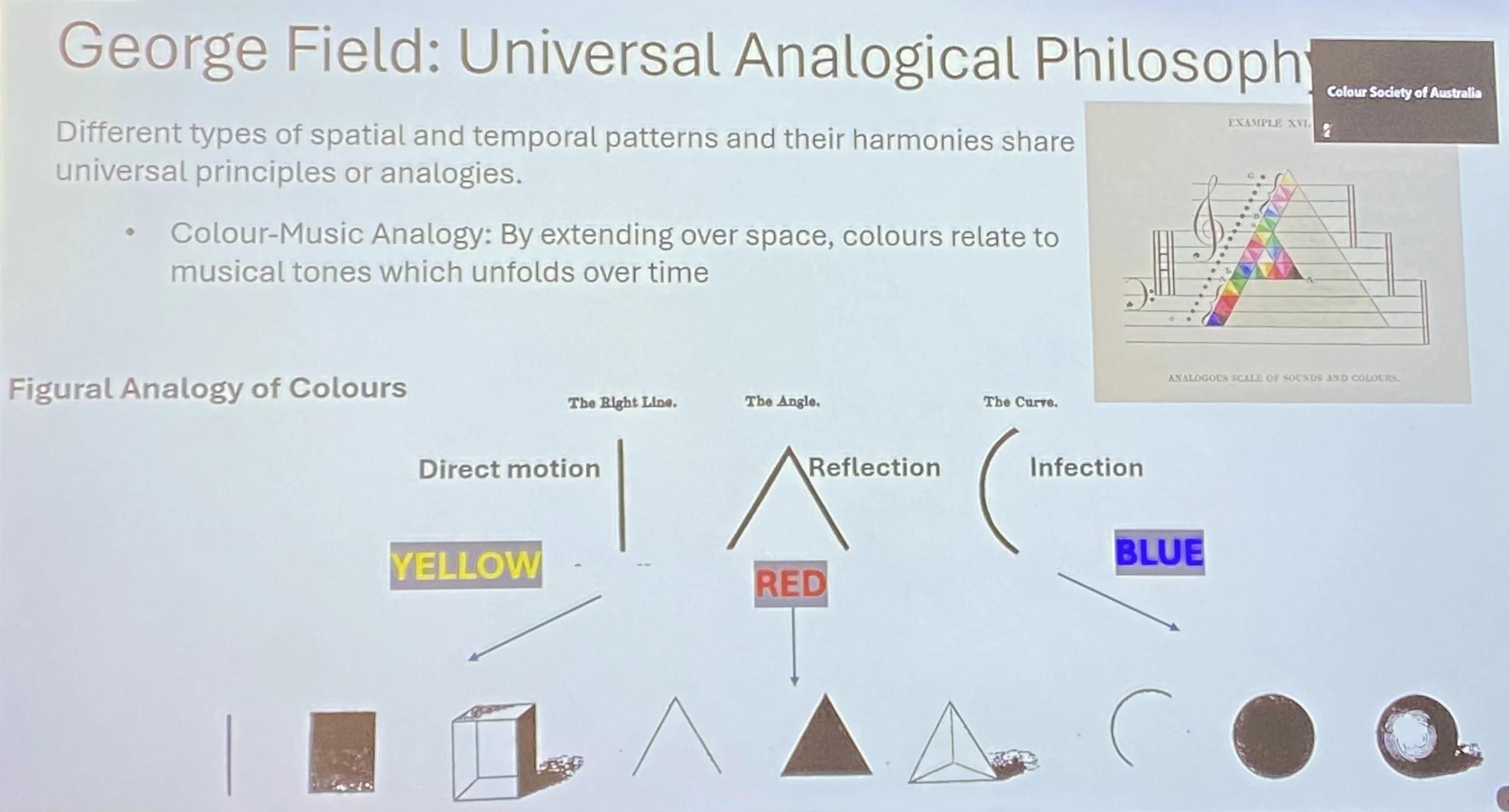
This is a photo I took of Braka Spehar’s screen based presentation at the Colour Society of Australia’s national conference. It refers to the work in cross-modal colour done by George Field (1817-1844).