Very Peri - an analysis of the colour of 2022
The first thing to note about Pantone’s colour of the year for 2022, Very Peri, is that it’s a play on the colour known as ‘Periwinkle’.
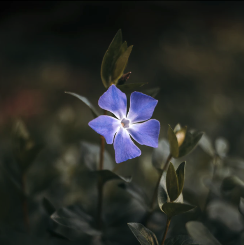
Periwinkle is named after the periwinkle flower which is a pastel purple, light lavender or blue purple, depending on how you see it. It is a mix of light blue and lavender and has a grey undertone.
Very Peri differs because it is a saturated version of periwinkle, as the adjective ‘very’ suggests.
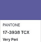

It is at least as deep as the deepest shade in the actual periwinkle flower and deeper than many of the shades we commonly think of as periwinkle (pictured on the right). It also has lots more grey in it. So to have Pantone describe Very Peri as a warm blue is astonishing to some of us!
A colour with lots of blue and a definite grey undertone can never be considered warm.
We can see, compared to 2018’s colour of the year, Ultra Violet, that is is clearly a cooler tone because it has more blue in it and less red.

It will work perfectly for anyone I have analysed who sits within the Serene, Sublime, Sophisticated or Elegant. These palettes are not only cool but they’re soft and have a smoky grey undertone.
It will also work well for those whose palette is Tranquil, Refined, Dynamic, Dramatic or Mysterious.
As happens every year, variations of the colour will emerge. They will be lighter, deeper, brighter and softer. But to my eye, they will not be fresh or novel. We’ve had numerous tones of lavender, violet and mauve for many seasons now, thanks to Ultra Violet’s outing in 2018. So although I don’t mind the hue, I don’t see it as exciting.
colour schemes
Below are some classic colour schemes using Very Peri as the base colour. You can use these in outfits and home interiors.

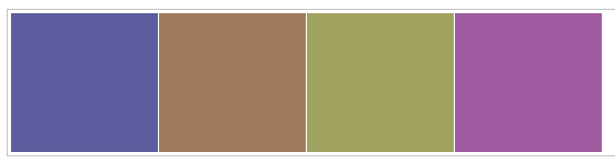
Analogous
Colours that sit next to each other on the colour wheel are always easy on the eye

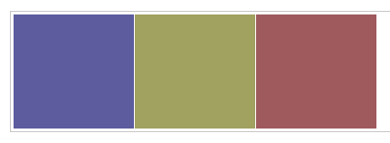
Complementary
Colours opposite each other on the colour wheel emphasise the differences in the other.

Monochromatic
Lighter and deeper tones of the same hue are easy to combine but may look monotonous unless another design element like texture or scale can add excitement.
More Very Peri colour inspiration: