
AI vs personal style consultants
With the advent of artificial intelligence (AI) some roles are about to become redundant. While this is a very real issue, work that is of a very personal nature, such as advising on individual style, is less at risk. And while there are apps that purport to tell you what to wear based on classic body shapes or colouring, if you have unique needs or really want to nail a look that’s right for you, AI or apps won’t do it for you.
BODY SHAPE
We humans really do come in all shapes and sizes and the classic pear shape / apple shape etc rarely apply precisely. Our physicality is so nuanced that we are generally a hybrid of these concepts.
For example, I am a slight inverted triangle shape (meaning my hips are slimmer than my shoulders) and the more I exercise my upper body, the more extreme this becomes. I am also somewhat of a figure eight shape, meaning I have a high hipped skeleton, unlike many women who have a low hip and carry their weight around their bum and thighs. While giving me slim thighs, my high hip means that if I put on weight, I can become an apple shape (round in the middle).
Not only is an app unable to realise that bodies fluctuate and are generally a hybrid of several shapes, it cannot assume what physical attributes people want to highlight and what they prefer to downplay. For example, I had a client with amazing legs, but due to her religious beliefs, she was not comfortable revealing them. Personal preferences are personal!
I can have two clients with very similar body types; let’s say they are both big busted and flat-bummed. One can hate one aspect and love the other attribute while the other client will feel exactly the opposite about her body. I never assume anything about the way people feel about their bodies. It’s only through having tactful and compassionate conversations that we can understand what someone likes about their physicality and what they are less comfortable with.
image injuries
In my experience, many people have what I call image injuries; things about their unique physical body that they feel particularly sensitive about, and thus want to downplay. Sadly, these things are often hugely exaggerated in a person’s mind and are usually something no-one else would ever notice.
Even though the image injury could be based on a throwaway comment from a casual observer decades ago, it doesn’t make the issue any less sensitive for the person as the injury is not based in logic. Their self perception may significantly impact the way they dress, therefore general recommendations thrown up by AI will be rejected. A good personal style consultant can reassure, provide objective advice and style workarounds to help people with image injuries whereas an app cannot reassure or advise on how to accommodate vulnerabilities.
UNIQUE STYLE
An app will not be across the most exciting clothes on offer; the custom-made, vintage and / or independently produced pieces. As someone who prefers to minimise reliance on mass-produced fashion brands, and support ethical and sustainable local makers, I will never be happy with styles an app can suggest to me.
I enjoy getting to know clients' unique tastes and fashion preferences. I like building trust, inspiring confidence and delving deep so I can advise people on how to achieve their sartorial aims. Lacking in human intuition and an emotional connection, AI can never truly grasp the nuances of someone’s style.
COLOUR ANALYSIS
There are ways to analyse your colouring using apps but having been a personal colour consultant since 2012, I know there are flaws in these processes, and if it’s not accurate, skewed recommendations defeat the purpose!
I offer online colour consultations as well as in-person ones and when I conduct an online consultation I scrutinise several good photos. Despite providing instructions on how to take good photos, they’re not always sent to me with the clarity required to analyse accurately (I know this because I also zoom with the client so I have the opportunity to cross-reference what they’ve sent. If I think there’s a discrepancy we address it before I recommend anything.
But if AI or an app simply accepts a photo on face value (lol!) and makes recommendations based on that, there’s no guarantee of accuracy. And if a person follows inaccurate colour advice, chances are they could be making worse colour choices than their previous hit and miss attempts.
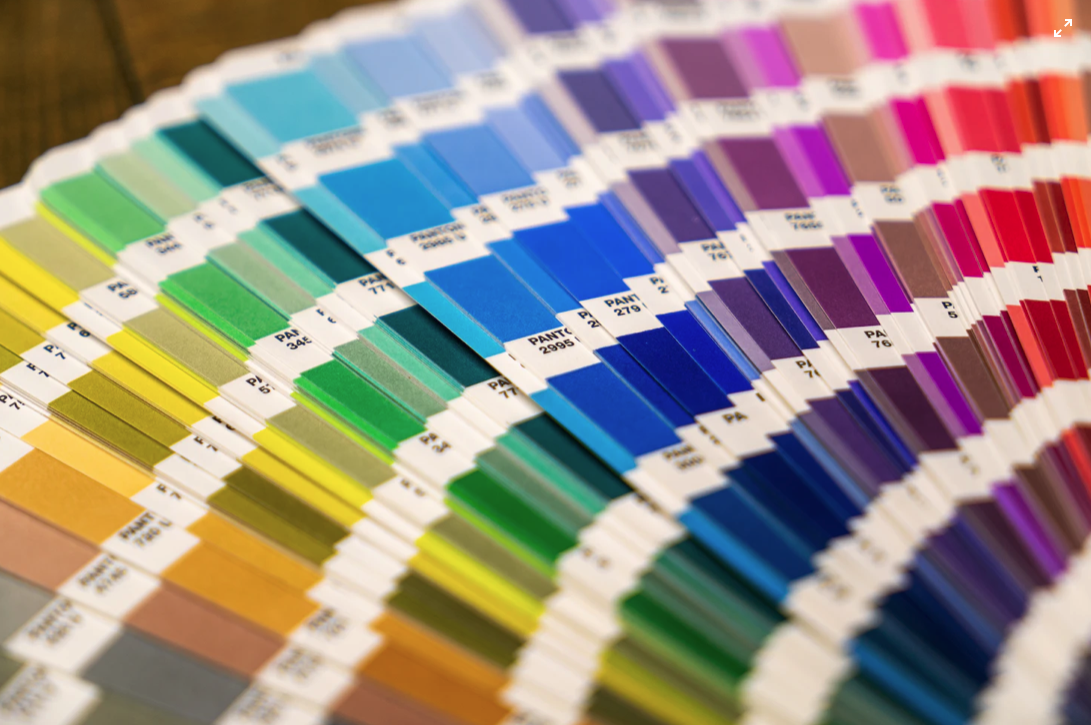
digital vs physical colour swatches
I simply don’t like digital colour palettes that are generated via AI. Comparing colours on screen (no matter how accurate) with colours in fabric is like comparing apples with oranges. They are completely different media and the colours are formulated differently.* Until we begin wearing light (ok, yes, you can dress your avatar!) then it’s best to have a physical colour swatch to compare to a physical garment than to rely on colours on a screen.
A key part of a personal colour analysis is to advise clients on value contrast. This is the difference between their lightest and deepest elements and informs the way they can co-ordinate colour to best effect. To my knowledge, apps don’t do this. Advising on prints and patterns is another aspect of colour analysis that differs for each client.
Finally, it’s a really nice bonus for a client bring some items of clothing in for discussion. Clients can learn a lot from this process in terms of identifying what will work for them.
in summary
If you want to develop true personal style that is tailored to everything that is important and unique to you and if you wish to empower yourself to make great clothing choices into the future instead of being directed towards where to buy the latest mainstream trends, you will benefit from consulting a personal style specialist.
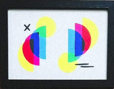

FOR COLOUR NERDS LIKE ME, this outlines how to create both physical (printed) colour and digital colour images
CMYK (cyan, magenta, yellow, key/black) is used for printing tangible objects (fabrics / paper etc). A printer combines physical cyan, magenta, yellow and black coloured ink. This is known as subtractive mixing. The inks are layered onto white, thus reducing the initial brightness to create particular colours. Mixing all the colours together creates black.
There’s an example of CMYK above left.
RGB (Red, Green and Blue) is used for digital images. Red, green and blue light are mixed in varying intensity within a device’s light source to create colours. It’s called additive mixing: into black darkness, the coloured lights are layered on top of each other to add brightness and create a pigment. When red, green and blue light are combined in equal intensity, they create white light.
There’s an example of RGB above centre.